color in interiors (part 4)
what COLORS to choose based on the presence of natural light
The same color can look dreamy or dull depending on how light hits it
North-Facing Rooms (with Cool, soft, indirect light)
Light: Cool, slightly gray, low warmth
Goal: Add warmth and depth
Best colors: Warm to counteract the coolness of northern light and make space feel more welcoming.
Warm whites (cream, ivory, soft beige)
Greige with warm undertones
Soft peach, blush, warm taupe
Muted terracotta, clay, camel
Avoid: Cool grays, Stark white, Icy blues or purples (feel flat and cold )
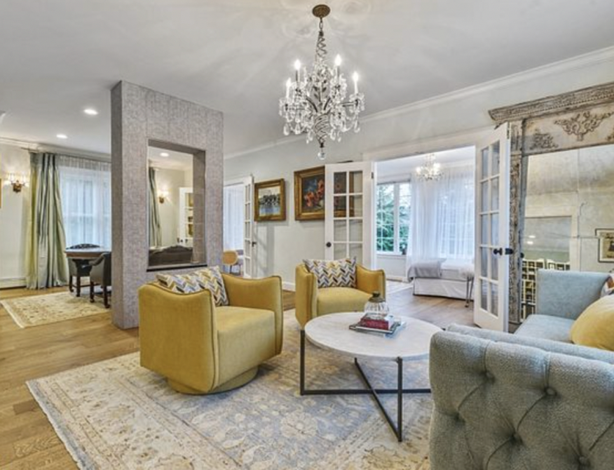
South-Facing Rooms (with Bright, warm, all-day sunlight)
Light: Strong, golden, consistent
Goal: Balance the warmth as the south light intensifies color
Best colors:
Crisp whites
Cool grays
Sage green
Blue-gray, dusty blue
Soft charcoal
Avoid: Very warm yellows or oranges (might feel too intense), Overly creamy whites (might look yellow)
East-Facing Rooms (Bright in the morning, cooler later)
Light: Fresh morning sun making colors glow in morning, with softer afternoon light
Goal: Stay bright avoiding going cold in the afternoon
Best colors:
Soft warm neutrals
Light sage or mint
Pale blue with warmth
Soft peach or blush
Avoid: Dark, heavy colors (feel gloomy in the afternoon) and Very cool grays
West-Facing Rooms (Warm, strong afternoon/evening sun)
Light: Golden, dramatic, absorbed by Deeper, muted colors
Goal: Soften intensity and glare
Best colors:
Muted neutrals
Olive, moss, forest green
Warm gray
Deep blue, navy
Taupe
Avoid: Bright whites (can feel blinding), Strong reds or oranges (too fiery at sunset)
Rooms with Limited or No Natural Light
Light quality: Flat, artificial
Goal: Maximize brightness and warmth to prevent the room from feeling closed-in or dull.
Best colors:
Soft white
Pale warm gray
Light beige
Gentle pastels (blush, sage, powder blue)
Avoid: Dark matte colors, Cool grays
Ceiling & Trim
Low light rooms: Keep ceilings lighter than walls
Bright rooms: You can match ceiling and walls for a modern look (layer with different finishes)
Trim: Use a slightly lighter or cleaner version of the wall color for cohesion
light cool colors for open, low-ceiling spaces
(by asteri design)
warm tones to ground the whites (cosentino)