color in interiors (part 3)
what COLORS to choose
Entryway & Foyer
Goal: First impression, welcome, sets the tone for the whole home
Best colors: Warm neutrals, soft greens, muted blues, terracotta, greige (Lighter colors help small or windowless entryways feel open).
Living Room
Goal: Comfort, connection, versatility, SPACE TO SOCIALIZE (RELAXING BUT NOT SLEEEPY)
Best colors: Warm neutrals, earthy tones, soft blues, olive, taupe LAYERED WITH BOLD ACCENTS
Dining Room
Goal: Appetite, warmth, gathering
Best colors: Deep reds, warm browns, charcoal, navy, muted mustard - rich colors that stimulate appetite and conversation, and feel elegant
kitchen
Goal: Cleanliness, energy, functionality
Best colors: Whites that reflect light, creams, soft grays, sage green, muted blues for fresh, spacious look; dark can work when paired with good lighting
bedroom
Goal: Rest, calm, intimacy
Best colors: Soft blues, muted greens, lavender, warm neutrals, blush to relax the mind and body—emotional comfort matters here.
bathroom
Goal: Clean, calm, spa-like
Best colors: Light colors make space feel bigger and cleaner, soft grays, pale blues, sage, sand tones for feeling of freshness and calm
home office & study
Goal: Focus, clarity, productivity
Best colors: Blue for focus and clarity, green to reduce eye strain, greige, muted neutrals
kid’s room
Goal: Energy and comfort, peacefulness and calm
Best colors: Soft pastels, cheerful mid-tones, balanced brights, nothing overwhelming, color should grow with the child.
Hallways & Corridors
Goal: Flow, connection
Best colors: Light neutrals, soft warm tones to prevent feeling cramped or dark; Repeate for cohesiveness.
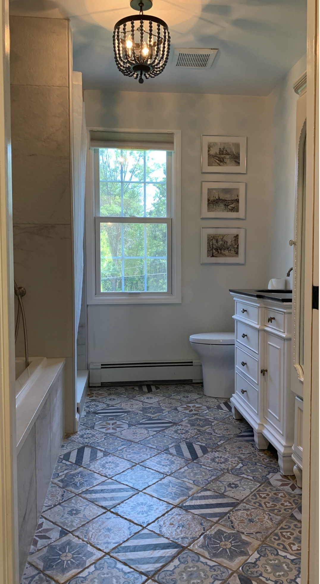
light cool colors, tiles and pattern for grounding
(by asteri design)
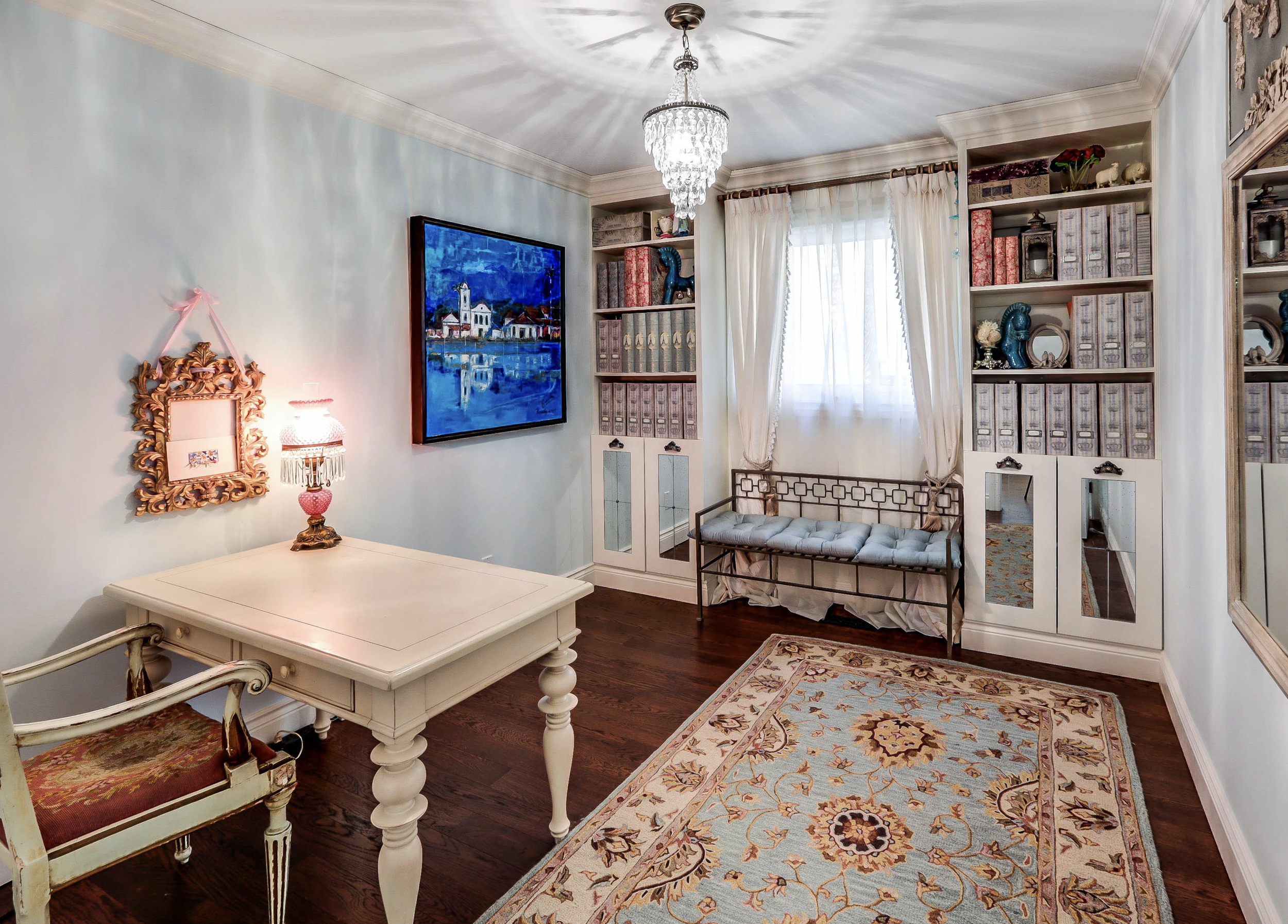
light-blue for focus, white and texture for grounding (by asteri design)