color in interiors (part 2)
Elements to consider when deciding which color to use
Purpose of the room:
Bedrooms and reading nooks profit from calming palettes; Social and active areas look best in warmer, livelier colors; Home offices love calming mid-tone blues or greens with warm accents to balance focus and energy.
Lighting: Natural and artificial light change how color shows.
North-facing rooms look cooler and may need warm paint to avoid them feeling dreary. South-facing rooms receive warm light and can handle cooler walls.
Room size and architecture: Light colors make rooms feel larger; dark hues can add coziness to open spaces. Architectural details can be emphasized or minimized using contrasting values.
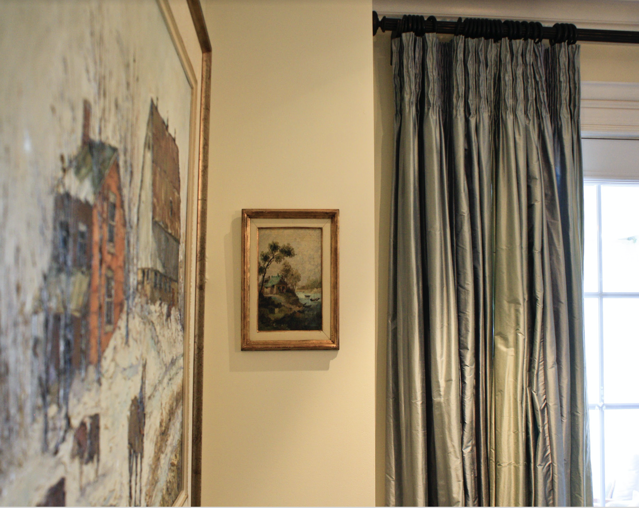
neutral as background for cool colors (by asteri design)
Practical guidelines
Start with function: Define how you want people to feel and behave in the room, and select a color family that supports that goal.
Test samples: Paint large swatches and observe them during the day and under different lighting.
Pay attention to finishes: Matte finishes absorb light and look softer; glossy finishes reflect light and feel more energetic.
Balance and layer: Combine a color of choice with a neutral that will provide a resting point for the eyes. Add one or two accent colors to create depth and flexibility, and prevent a space from feeling flat. colors can also successfully be combined with textiles, furniture, and accessories
primary color main characteristics
Red: energetic and intense; brings warmth and passion to a room. In proper hues, it can make a room feel intimate and stimulating.
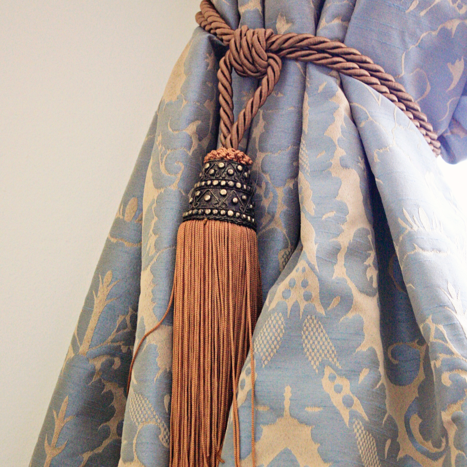
use bold, saturated colors in accents (by asteri design)
Blue: Calm and stable: is ideal for spaces dedicated to relaxation, like bedrooms or offices.
Green: think nature and renewal; promotes calmness and balance. best suited to living areas and spaces meant for rejuvenation.
Yellow: Bright and cheerful and energizing; perfect for kitchens and breakfast nooks.
Purple: a bold statement Often associated with luxury; versatile: from muted violets for a relaxed feel to rich purples for sophistication.