color in interiors (part 1)
Color is a powerful, fundamental tool in interior design.
It shapes atmosphere and how spaces are perceived and experienced by influencing mood, scale, and function.
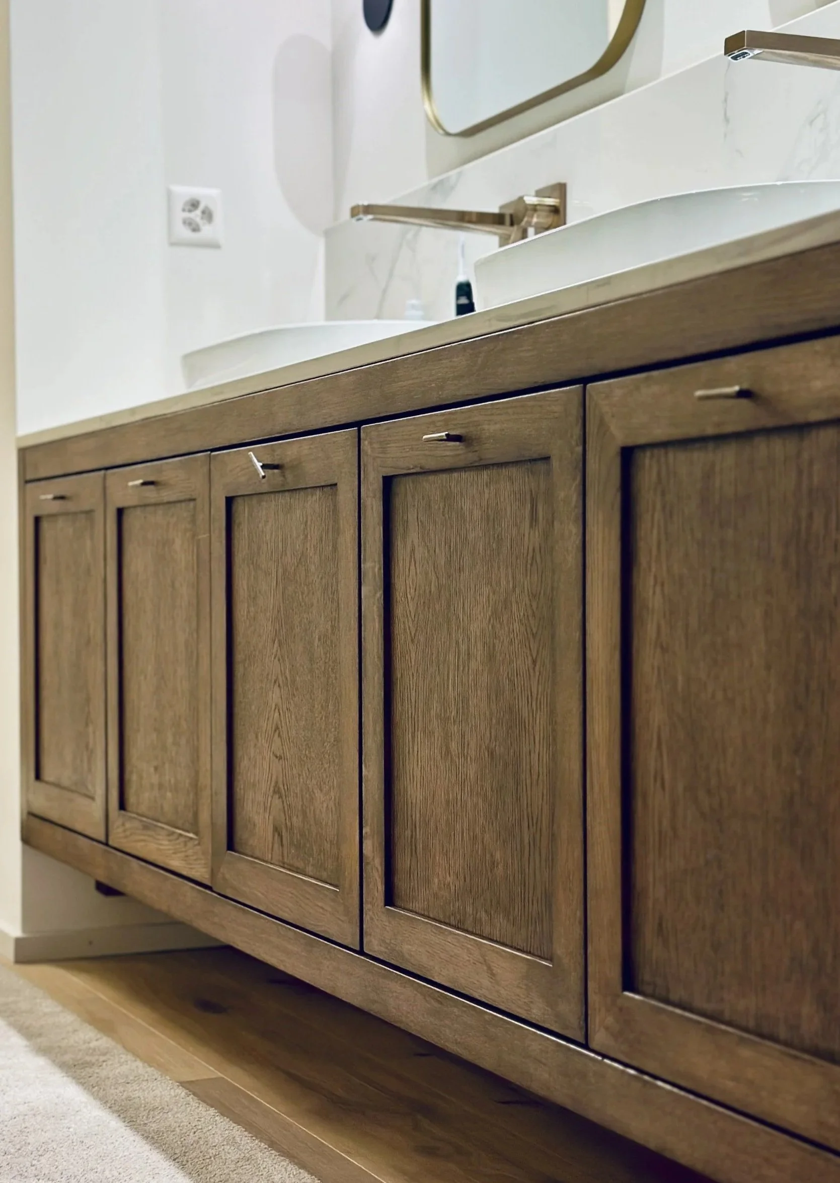
neutral tones for sophistication (by asteri design)
Thoughtful selection—based on function, light, scale, and occupant needs—can promote desired moods.
Different hues, values (lightness/darkness), and saturations (intensity) interact with natural and artificial light, altering appearance throughout the day, enhances functionality, supports desired emotional responses, and elevates the overall design coherence of any interior.
Warm hues: reds, oranges, and yellows can energize and stimulate.
Cool tones: blues and greens promote calm and relaxation.
Neutral: provide balance and flexibility to layer texture and accents.
Color can create spaces that feel intentional and livable: visually enlarge a small room, create focal points, define separate zones in open-plan layouts, and reinforce a room’s purpose.
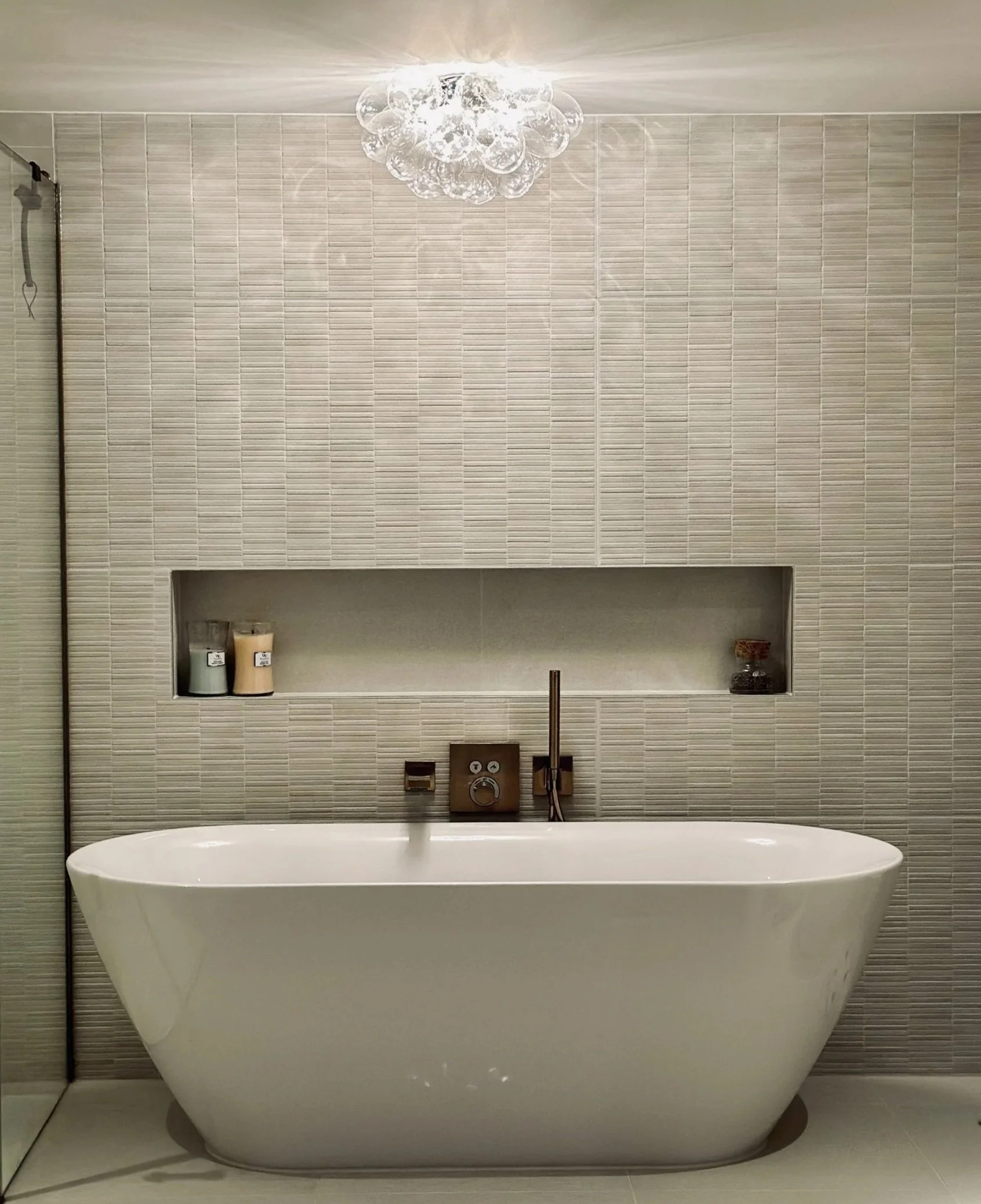
cool tones - calm and relaxation (by asteri design)
How color affects mood
Warm colors (red, orange, yellow): energize and stimulate. They can raise perceived temperature, increase appetite, and create a sense of intimacy or excitement.
In dining rooms, kitchens, or social areas, warm tones encourage activity and conversation.
Overuse or very saturated warm colors can feel overwhelming or agitating.
Cool colors (blue, green, violet): promote calm, focus, and relaxation. Blue is often associated with serenity and concentration, making it suitable for bedrooms, bathrooms, and offices.
Green, linked to nature, conveys balance and restoration and works well in living spaces and work areas needing low stress.
Very dark or desaturated cool colors can feel cold or distant if not balanced with warm accents or proper lighting.
Neutrals (white, gray, beige, taupe): create a backdrop that supports other design elements. They can make spaces feel clean, sophisticated, or spacious.
However, too much neutrality without texture or accent color can make a room feel bland or impersonal. Warm neutrals add coziness; cool neutrals read more modern and minimal.
Accent colors: Strategic—pillows, artwork—adds energy, and personality without overwhelming a space.
Accent colors guide attention and can be changed seasonally or with trends at low cost.
Pastels and muted tones: Softer, desaturated colors feel gentle and comforting. Pastels are often used in nurseries, healthcare, and hospitality to soothe and reassure.
Muted tones offer sophistication and longevity in residential and commercial interiors.